

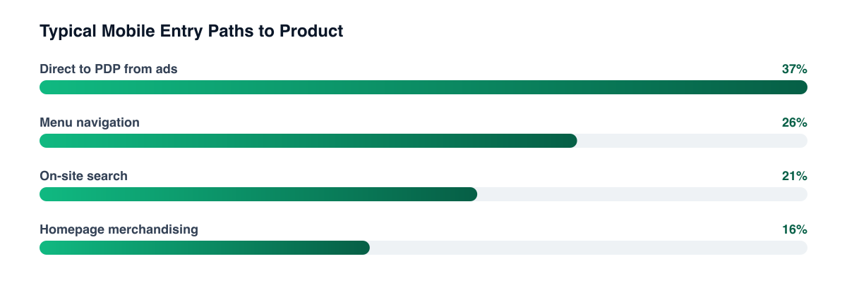
Look at the click data on a mobile Shopify store and the hamburger menu is almost always in the top three most-tapped elements. Look at the test log and it's almost never been touched.
"The menu is the only part of the site every visitor uses and nobody owns. It gets built once, from the catalogue, and then it's furniture."
— Aashish Kasma, Co-Founder — Data & Analytics
Why does a collapsed desktop menu fail on mobile?
Because a mega menu works by showing everything at once, and a mobile menu can't. What survives the collapse is the structure — five top-level categories with nested subcategories — without the thing that made the structure usable, which was seeing the options side by side.
The result is a menu that requires a customer to guess which top-level label contains what they want, tap, be wrong, and go back. Each of those taps is an exit opportunity, and on a mobile session there aren't many to spare.
What should the mobile menu actually contain?
Order it by demand, not by taxonomy. The four things worth putting above the fold of an open menu:
- The two or three categories that produce most of your revenue. Not all of them, and not in alphabetical order.
- A search entry point, visible rather than hidden behind an icon. For catalogues past a modest size, search converts better than browse — which is why site search deserves its own optimisation work.
- The occasion-based entries people actually use: New, Sale, Bestsellers, Gifts. These are how customers describe what they want; your category tree is how you describe your inventory.
- Account and order tracking. A meaningful share of menu taps are existing customers looking for a delivery, and sending them through a category tree to find it is a support ticket in the making.
Everything else goes below, or goes away.
How deep should the hierarchy go?
Shallower than most stores build. Each additional level roughly halves the number of people who reach the bottom of it, and three-level navigation on mobile is where catalogues go to be undiscovered.
If the catalogue genuinely needs depth, put the depth in filters on the collection page rather than in the menu. A customer who lands on a broad collection and narrows with filters is in a forgiving interface with everything visible; the same customer navigating a nested menu is making blind choices. This is also the more honest answer to the collection page versus landing page question — a well-filtered collection page does a lot of work a menu can't.
Instrument the menu before you redesign it Tap-level data on which entries get used, and which lead to a bounce-back, turns this from an opinion argument into a twenty-minute decision. Most stores have never recorded it.
What's worth testing first?
Three changes, in order of typical impact: reordering top-level entries by revenue, promoting search to a visible field, and flattening one level of hierarchy on your largest category. Each is a small change with a mechanical rationale, which is what makes them good candidates for a CRO test rather than a redesign.
Test them one at a time, on mobile only, and watch the whole path rather than menu engagement alone — a menu change that increases taps but not add-to-carts has made the site busier, not better. And check the render behaviour while you're in there: menus that shift or delay on open are a common site speed casualty, and no amount of information architecture fixes a menu that arrives late.
Related guides
- Shopify CRO: The Complete Guide
- Site Search on Shopify: The Feature Your Best Customers Use
- How to Build a High-Converting Product Page
- Landing Pages vs. Collection Pages: Where Paid Traffic Should Land
Navigation gets treated as a build decision and behaves like a conversion element. Reorder it by revenue, flatten it, and put search where people can see it — three of the cheapest wins available in a Shopify CRO programme.
PART OF OUR SERVICE
Shopify & CRO
PROOF FROM A CLIENT
+68% revenue per visitor
without increasing ad spend · Health & Wellness
How a Health Brand Lifted Revenue Per Visitor by 68%→Want a free marketing audit?
We'll review your tracking, ad accounts, and funnel — and show you exactly where the gaps are.
Get Your Free Audit →