
Most D2C brands point paid traffic at whatever page already exists — a collection, a product page, sometimes the homepage — because building a dedicated landing page is work nobody scheduled.
"A collection page is built for a shopper who's already browsing your store. Paid traffic hasn't decided to browse yet — it's still deciding whether to stay."
— Dhruvit Shah, Co-Founder — Performance Marketing & Growth Strategy
What does a collection page get wrong for cold traffic?
It assumes context the visitor doesn't have. A collection page opens with a grid of options and no argument — no restatement of the promise from the ad, no proof, no reason this brand is worth a purchase over the three tabs already open. A returning shopper fills that context in from memory. A cold click from a paid social ad has about two seconds of it, and a grid of twelve products asks them to make a choice before they've been given a reason to care.
The other half of the problem is message match. If the ad sold one specific benefit and the landing experience is a catalogue of everything, the visitor has to re-find the thing that made them click.
So should every campaign get a dedicated landing page?
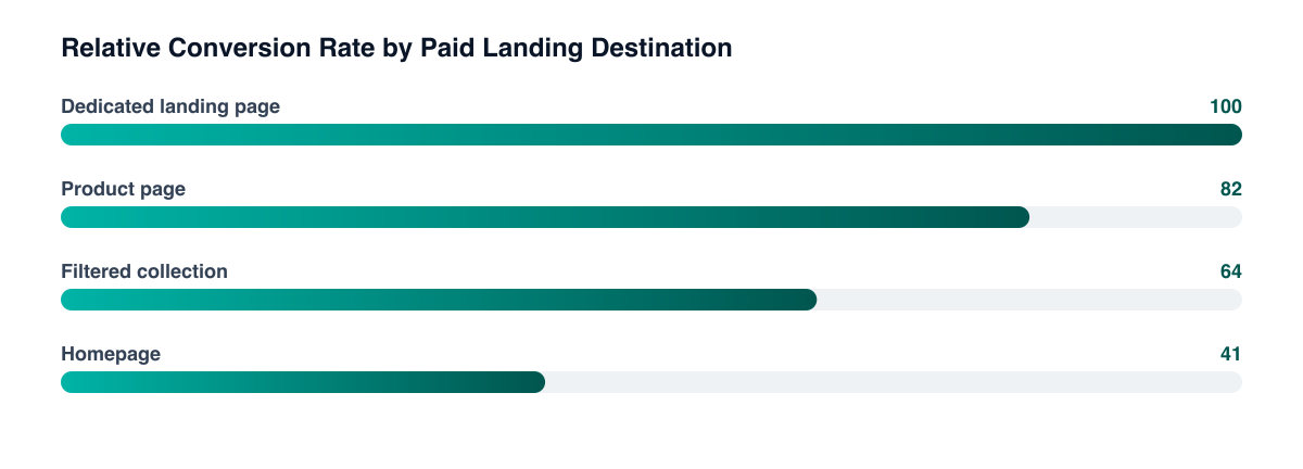
No — and this is where the advice usually oversells. A dedicated landing page earns its build cost when the campaign has enough sustained spend to justify iteration, when the offer or angle isn't represented anywhere on the existing site, or when you're selling a bundle or a use case rather than a single SKU. Below that threshold, the maintenance burden of orphaned pages that drift out of date with pricing and inventory costs more than the lift.
For most single-product campaigns, a well-built product page with the ad's angle reflected above the fold outperforms a hastily-built landing page — and it stays in sync with inventory automatically.
The cheap middle option A filtered or curated collection with a real hero section — headline matching the ad, one proof point, one CTA — captures most of the gap between a raw collection and a custom landing page, and it inherits your existing product data instead of duplicating it.
What actually has to be above the fold?
- The same claim the ad made, in recognisable words — not a cleverer variant of it.
- One proof element: a review count, a recognisable logo, a before/after, a specific number. One, not a wall.
- A single primary action. A page offering "shop now," "take the quiz," and "get 10% off" simultaneously converts worse than any one of them alone.
- Price or price framing, visible without scrolling — hiding it doesn't defer the objection, it just adds a scroll before the bounce.
How do you know which one is actually better for your traffic?
Run it as a real split rather than a before/after comparison, because seasonality and creative rotation will otherwise take credit for the result. Route the same campaign's traffic across both destinations simultaneously, hold everything upstream constant, and judge on conversion rate and revenue per session — a landing page that converts better on a lower AOV bundle isn't automatically the winner. The same testing discipline that applies to on-page elements applies to the destination choice itself.
Related guides
- Anatomy of a High-Converting Product Page
- Shopify CRO Tests Worth Running First
- Quiz Funnels for D2C Product Discovery
- Paid Social Funnel Playbook
The destination decision usually gets made once, by default, and then never revisited while everyone optimises creative. It's often the cheapest conversion lift available — no new ad spend, no new creative, just sending the click somewhere that answers it.
PART OF OUR SERVICE
Shopify & CRO
PROOF FROM A CLIENT
+68% revenue per visitor
without increasing ad spend · Health & Wellness
How a Health Brand Lifted Revenue Per Visitor by 68%→Want a free marketing audit?
We'll review your tracking, ad accounts, and funnel — and show you exactly where the gaps are.
Get Your Free Audit →