
Every product page has a review widget, and almost nobody has looked at what theirs is doing beyond checking that the star rating is high. That's a shame, because the widget sits directly between the price and the buy button.
"A five-star average with forty reviews converts worse than a 4.4 with four hundred. Perfection reads as filtered."
— Dhruvit Shah, Co-Founder — Performance Marketing & Growth Strategy
What is the customer actually looking for?
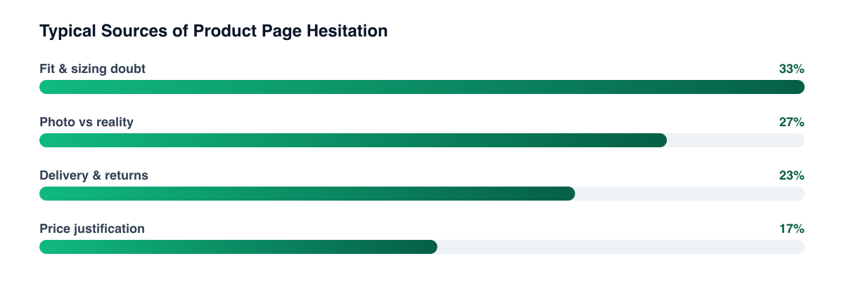
Not reassurance that the product is good — they mostly assume that by the time they've reached the page. They're looking for the specific risk that would make this purchase a mistake for them: whether the sizing runs small, whether the shade matches the photo, whether it survives a dishwasher.
That reframes the job. The review section isn't a trust badge, it's an objection-handling surface, and its value depends on whether a shopper can find the review that addresses their particular hesitation in a few seconds.
Which parts of the widget do the work?
In rough order:
- Review count above a credibility floor. The jump from a handful of reviews to a substantial number matters enormously. The jump from substantial to enormous barely registers.
- Distribution, visibly. Showing the spread — including the one- and two-star bars — increases trust rather than reducing it, because it demonstrates the reviews aren't curated.
- Attribute filters. Letting a shopper filter by their own size, skin tone, or use case is the difference between a wall of text and an answer.
- Customer photos. The single most effective element on most pages, because it resolves the "photo vs reality" gap that studio imagery creates — the same tension covered in UGC vs studio creative.
- The star average. Real, but the weakest of the five once the others are in place.
Do negative reviews hurt?
Less than removing them does. A page with no criticism gives the shopper nothing to calibrate against, and a meaningful share of shoppers deliberately read the low-star reviews first — a well-documented behaviour that widget design usually ignores by burying them.
The exception is honest: a cluster of recent negative reviews about the same defect is a genuine conversion problem, and no amount of display strategy fixes it. That's a product or fulfilment signal, and treating it as a CRO problem is how brands spend months optimising around something they should have fixed. Reviews complaining about delivery or returns belong in the returns experience work, not the page design work.
Answer the negative reviews publicly A visible, specific brand response to a criticism converts better than the criticism absent. Silence reads as either indifference or an unmonitored widget.
Where does social proof stop paying?
At the point it becomes decoration. Trust badges nobody recognises, "247 people viewing this" counters, and stacked press logos from a decade ago consume attention above the fold and add no information the shopper can use. Several of these are actively suspicious to an experienced online shopper.
The test for any social proof element is whether it resolves a specific doubt. If it doesn't, it's competing with the elements that do — and on mobile, where the fold is small and the buy button is the whole game, that competition is expensive. Run the removal as a test the same way you'd run an addition, because they're the same CRO test in different directions.
Related guides
- How to Build a High-Converting Product Page
- Shopify CRO: The Complete Guide
- How to Reduce Cart Abandonment on Shopify
- UGC vs. Studio Creative: Which Performs Better and When
Social proof works when it answers a question the shopper was already asking. Audit the widget against the top three objections in your support inbox — it's a faster path to conversion than another round of copy edits in most Shopify CRO programmes.
PART OF OUR SERVICE
Shopify & CRO
PROOF FROM A CLIENT
+68% revenue per visitor
without increasing ad spend · Health & Wellness
How a Health Brand Lifted Revenue Per Visitor by 68%→Want a free marketing audit?
We'll review your tracking, ad accounts, and funnel — and show you exactly where the gaps are.
Get Your Free Audit →