

The default creative brief in D2C now starts with video. It's a reasonable default and a bad rule, because it quietly removes the cheapest, fastest-iterating format from the test plan.
"A static ad gives you one frame to be understood in. That constraint is why the good ones out-test video — they had to say it immediately."
— Palash Shukla, Creative Designer
Where do statics actually win?
In placements and moments where the viewer isn't watching anything. Feed placements where sound is off and thumbs are moving, retargeting audiences who already know the product and need a reason rather than an introduction, and any offer that can be understood in a glance — a discount, a bundle, a new colourway.
There's also a product dimension. Products whose value is visual and immediate — apparel, homeware, packaging-led categories — often communicate more in one well-shot frame than in fifteen seconds of movement. Products whose value is a demonstration — anything that transforms, assembles, or does something surprising — need video, and no static will substitute.
Why does the economics argument matter more than the performance one?
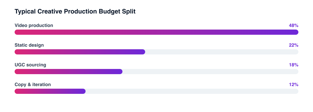
Because it changes how many attempts you get. A video concept is a shoot, an edit, and a review cycle. A static concept is an afternoon. Under a creative testing framework, the format that lets you run five hypotheses in the time video runs one is worth having in the mix even if its average performance is slightly lower.
That's the honest framing — and where the advice usually oversells. Statics don't beat video on average across most accounts. They beat video on cost per learning, and they beat video in specific placements. Both of those are reasons to run them, neither is a reason to stop making video.
What makes a static work?
Four things, and the order is roughly the order the eye takes them in:
- One idea. A static that carries two messages carries neither. If the brief has an "and" in it, it's two ads.
- A legible product. The product must be identifiable at feed size on a phone, which is smaller than the canvas anyone designs on.
- Text that survives compression. Long copy in a small frame is a decorative texture, not a message. Six words, large.
- A visual hierarchy that leads to the offer, not a layout that balances the composition. These are frequently in conflict, and performance work resolves it toward the offer.
Design at feed size, not at canvas size Most static ads that fail in testing were approved at full screen and served at thumbnail. Review every concept at the size it will actually appear before it ships.
How should the mix be structured?
Keep video as the prospecting workhorse where the product needs demonstrating, and put statics to work in three places: retargeting, offer communication, and rapid concept testing. Concepts that win as statics can then be produced as video — which is a far cheaper way to decide what to shoot than deciding in a planning meeting.
The hook discipline transfers directly. A static is a hook with no follow-up, which makes it an unusually clean test of whether the idea itself is compelling or whether the video was carrying it. Several accounts discover their best-performing video was working because of its first frame — and that frame was a static all along.
Related guides
- D2C Creative Strategy: The Complete Guide
- Building a Creative Testing Framework That Produces Answers
- UGC vs. Studio Creative: Which Performs Better and When
- The First Three Seconds: Writing Hooks That Stop the Scroll
Format is a decision, not a default. Reserve video for what needs demonstrating and let statics carry the offers and the testing volume — it's usually the cheapest way to increase creative throughput in a creative and branding programme.
PART OF OUR SERVICE
Creative & Branding
Want a free marketing audit?
We'll review your tracking, ad accounts, and funnel — and show you exactly where the gaps are.
Get Your Free Audit →