

Most brands unlock A+ content, upload a few lifestyle images, and call it done. Then they wonder why conversion rates barely moved. A+ content is not a design exercise — it's a structured answer to every question that would otherwise kill the sale. The conversion figures here come from A+ rollouts we've audited across brands, not from Amazon-published averages.
"A+ content is not a design exercise — it's a structured answer to every question that would otherwise kill the sale."
— Dhruvit Shah, Co-Founder — Performance Marketing & Growth Strategy
Done right, Amazon's own data shows A+ content lifts conversion rates by 3–10% on average. Done wrong, it's a wall of branded imagery that shoppers scroll past on their phone without reading a word.
What is A+ content and who can use it?
A+ Content (formerly Enhanced Brand Content) lets brand-registered sellers replace the plain-text product description with rich media modules — images, comparison charts, text overlays, feature callouts, and more. It lives below the bullet points and above customer reviews.
Eligibility requires:
- Active enrollment in Amazon Brand Registry (requires a registered trademark)
- Selling on Amazon as a brand owner (not a reseller)
- A Professional Seller account
Once enrolled, A+ is available at no additional cost for standard modules. The upgraded tier — Premium A+ (A++) — is available by invitation to brands meeting volume and performance thresholds.
If you're working with an agency on your marketplace management, confirm they're building A+ as part of your listing strategy from day one, not as an afterthought once sales plateau.
What modules are available to you?
Amazon offers a modular building system. The most useful ones:
Standard A+ modules:
- Company logo — anchors brand identity at the top
- Feature callout with text — icon + short headline + paragraph, stacked or grid
- Standard image with text overlay — lifestyle image with copy on top
- Comparison chart — cross-sells your product line or compares to alternatives
- Technical specifications table — structured data for ingredient lists, dimensions, materials
- Four-image text quadrant — balanced grid for use cases or benefit breakdowns
Each ASIN can use up to 5 modules per A+ page. That constraint forces prioritization — which is actually useful.
The comparison chart module is the most underused high-value module. Brands that add comparison charts between their own product variants see measurable lift in basket size, because buyers can self-select the right SKU instead of leaving to research.
Build to the buyer's question hierarchy
The biggest mistake in A+ content is designing for the brand, not the buyer. Shoppers land on a detail page with a stack of unspoken questions. Your A+ content needs to answer them in sequence — not in whatever order your creative team found visually interesting.
The question hierarchy:
- What is it, literally? (Product category, primary function, who it's for)
- Why does this feature matter to me? (Translate specs into outcomes)
- What makes this different from alternatives? (Comparison, differentiators)
- Why should I trust this brand? (Credibility signals, origin story, certifications)
Most A+ pages fail at step 2. They list features — "made with 12-strand braided construction" — without connecting them to buyer outcomes — "won't snap under 500 lbs of tension, even wet." The feature is forgettable. The outcome is why someone buys.
This same principle applies across all product detail pages. The approach mirrors what converts on The Anatomy of a High-Converting Shopify Product Page — answer objections in the order buyers have them, not in the order that looks good in a mockup.
Why should you always design for mobile first?
Over 80% of Amazon browsing happens on mobile. This single fact should govern every A+ design decision.
What this means in practice:
- Text overlaid on images often becomes unreadable at mobile sizes — use high-contrast backgrounds or keep overlay text to 3–5 words max
- Horizontal comparison charts collapse into single columns on mobile — verify every module in Amazon's mobile preview before publishing
- Lifestyle images with small product shots lose the product entirely at 390px width — the product should be recognizable at thumbnail scale
- Long-form text blocks don't get read on mobile — break copy into scannable chunks of 2–3 sentences max
Amazon's Content Manager has a mobile preview toggle. Use it for every module before submitting. Most A+ content that underperforms is built in desktop view and never checked on a phone.
The conversion rate case
The 3–10% conversion lift Amazon cites is an average across all categories. The real range is wider — commodity products in crowded categories see less impact; considered purchases where buyers research heavily see more.
Categories where A+ content consistently moves the needle:
- Supplements and health products — ingredient tables and efficacy claims reduce uncertainty
- Electronics and home goods — technical spec comparisons reduce returns and pre-purchase hesitation
- Apparel and home decor — lifestyle imagery answers "will this work in my space / on my body"
- Baby and pet products — trust signals and safety certifications are conversion levers
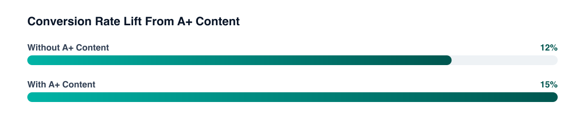
For context: if your listing converts at 12% and you lift it by even 3 percentage points to 15%, that's a 25% increase in units sold from the same traffic. At scale, that compounds. A+ content is among the highest-leverage, lowest-cost conversion tools available on the platform.
Pair it with the fundamentals covered in Amazon Product Listing Optimization — title, bullets, backend keywords — and you compound both ranking and conversion together.
Premium A+ (A++): what changes?
Premium A+ unlocks additional modules and significantly larger image real estate:
- Full-width hero images (up to 1464px wide vs. standard 970px)
- Video modules embedded directly in the content section
- Interactive hotspot images — buyers tap areas of a product image to reveal features
- Enhanced comparison charts with more rows and richer formatting
- Background image behind text modules for stronger brand expression
Amazon grants Premium A+ access to brands that have published A+ content on at least 5 ASINs and have an active Brand Story on their storefront. It's not a paid upgrade — it's earned by using the standard tools consistently.
If you qualify, the video module alone is worth the effort. Product videos in the A+ section don't require the same production quality as the hero video at the top of the listing — a 45-second demonstration that answers the top buyer objection outperforms a polished brand film almost every time.
What common mistakes should you avoid?
Mistake 1: Repeating bullet points verbatim. A+ content should extend the conversation, not restate what's already above the fold. If a buyer scrolled past your bullets to read A+, they want more depth or a different angle.
Mistake 2: Pure lifestyle imagery with no informational content. Beautiful images help brand perception. They don't answer "will this fit my 9-inch tablet?" Use a mix of lifestyle and technical content.
Mistake 3: Ignoring the comparison chart when you have multiple SKUs. If you sell a 3-pack and a 6-pack, or a standard and a premium version, the comparison chart prevents buyers from defaulting to the cheapest option out of uncertainty.
Mistake 4: Submitting without mobile QA. Amazon's review team will approve content that looks broken on mobile. That's your problem, not theirs.
Mistake 5: Treating A+ as a one-time project. Refresh A+ content when you launch new SKUs, when you identify new buyer objections in reviews, or when conversion data shows a specific module isn't performing. It's a living asset.
The bottom line
A+ content is a structured conversion tool, not a branding exercise. Build it around the sequence of questions buyers ask before purchasing, design every module for mobile first, and use the comparison chart to capture buyers comparing your own SKUs. The brands seeing 8–10% conversion lifts are the ones treating A+ as a buyer decision aid — not a place to put their logo and some product shots.
Related guides
PART OF OUR SERVICE
Marketplace Management
Want a free marketing audit?
We'll review your tracking, ad accounts, and funnel — and show you exactly where the gaps are.
Get Your Free Audit →