

Revenue can grow every month while retention quietly gets worse the entire time — and a top-line dashboard will never show you this. New customer acquisition can mask a shrinking base of repeat buyers for a surprisingly long time. Cohort analysis is the one report that can't hide it.
What does a blended metric hide?
"32% repeat purchase rate" sounds like a single fact. It's actually an average across every customer who's ever bought, at every stage of their relationship with the brand — a customer from 18 months ago who's since churned counted the same as a customer who bought yesterday. Blended retention numbers can hold steady or even improve purely because acquisition volume is rising, while the actual retention curve for any given month of customers is getting worse. By the time a blended metric drops enough to notice, the underlying problem has usually existed for two or three quarters.
The tell If CAC is climbing and blended repeat rate is flat, don't assume retention is fine — check whether newer cohorts are retaining worse than older ones. Flat blended numbers with rising acquisition costs are one of the most common early signs of retention decay.
What does a cohort table actually show?
A cohort table groups customers by the month they first purchased, then tracks what percentage of each group buys again in month 1, month 2, month 3, and so on. Read down a column and you see how a single month's customers behave over time. Read across a row and you compare acquisition months against each other at the same point in their lifecycle.
The pattern to look for is the shape of the curve, not any single number:
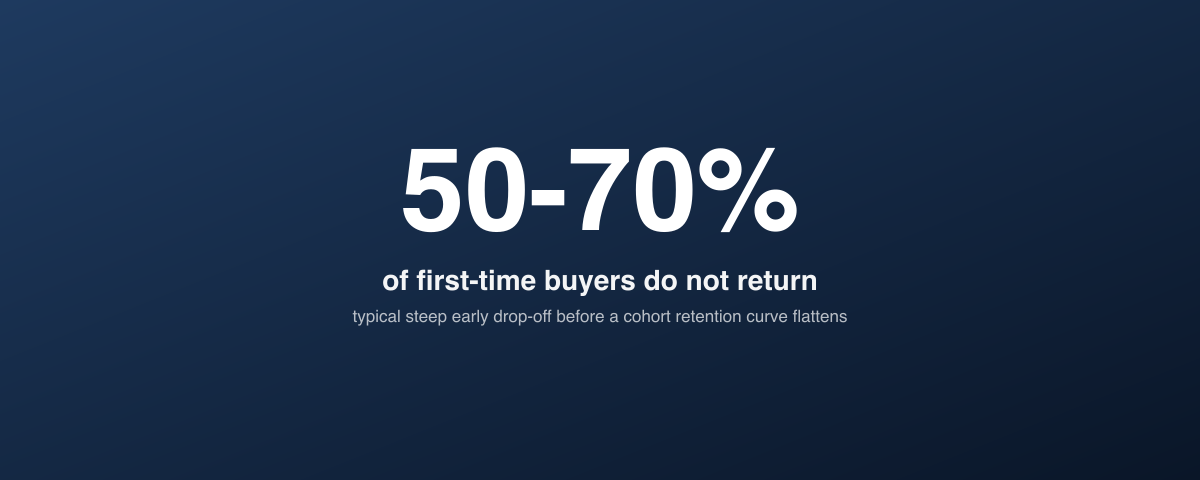
- A steep early drop, then a flat tail is normal — most brands lose 50–70% of first-time buyers within 60 days, and the customers who remain after that point tend to stick around much longer.
- A curve that never flattens — retention keeps bleeding month over month with no plateau — means there's no loyal core forming at all, which is a product-market fit or experience signal, not just a marketing one.
- Newer cohorts retaining worse than older ones is the clearest early warning that something changed — a channel mix shift, a discount-driven acquisition push, or a product/fulfillment issue — before it shows up anywhere else.
How do you build one without new tooling?
You don't need a dedicated analytics platform to build a first cohort table. Shopify order data (customer ID, order date, order number) exported to a spreadsheet is enough to build a basic version:
- Group customers by the month of their first order.
- For each cohort, calculate the % who placed a second order in each subsequent month.
- Lay cohorts as rows and months-since-first-purchase as columns.
This gets you 80% of the insight. A dedicated analytics stack or warehouse-based model is worth building once you need to slice cohorts by multiple dimensions at once or refresh the view daily — not before.
Why should you segment cohorts by acquisition channel, not just by month?
The single most useful cut beyond month-of-acquisition is channel. Customers acquired through a 30%-off influencer code and customers acquired through organic search or referral almost always show meaningfully different retention curves — and blending them into one company-wide number erases the difference.
What this usually reveals Paid social prospecting cohorts, especially ones acquired via steep first-order discounts, frequently retain at half the rate of email list, referral, or organic cohorts. This doesn't mean paid social is a bad channel — it means the CAC for that channel needs to be evaluated against its actual retention curve, not blended company-wide LTV.
Run the same cohort structure split by first-order discount depth (full price vs. 10–20% off vs. 30%+ off). Heavy discounting to acquire a first order routinely produces the worst-retaining cohorts in the business — a pattern that's invisible until you isolate it.
How do you turn the curve into a decision?
Cohort analysis is only useful if it changes a budget or product decision. A few of the most common actions it should trigger:
- Reallocate acquisition spend away from channels whose cohorts show consistently weak month-2/month-3 retention, even if their initial CAC looks competitive.
- Fix the post-purchase window if the steepest drop-off consistently happens in the same window (e.g., between order 1 and order 2) — that's a signal for a lifecycle flow or loyalty program gap, not an acquisition problem.
- Recalculate LTV assumptions used in CAC payback and attribution models — a blended LTV figure built on an outdated cohort curve will consistently overstate how much you can afford to pay for a new customer.
Related guides
- Customer Lifetime Value: The Metric That Should Drive Every Marketing Decision
- D2C Analytics and Attribution: The Complete Guide to Measuring What Actually Works
- Attribution Modeling 101: Why Last Click Is Killing Your Growth
- D2C Customer Segmentation: How to Divide Your List to Multiply Revenue
Revenue growth tells you what happened. Cohort analysis tells you whether it's durable.
"Revenue growth tells you what happened. Cohort analysis tells you whether it's durable."
— Aashish Kasma, Co-Founder — Data & Analytics
Any brand scaling acquisition spend without checking the retention curve underneath it is making a bet on a number that a blended dashboard was never built to show. Standing up the cohort view is a small piece of data and analytics work that quietly changes every acquisition decision made after it.
PART OF OUR SERVICE
Data & Analytics
Want a free marketing audit?
We'll review your tracking, ad accounts, and funnel — and show you exactly where the gaps are.
Get Your Free Audit →